There was a time when every video game console came wrapped in plastic and promise, and the promise usually involved a color. For Xbox, the color was green — a neon, slightly aggressive green that suggested both night vision and Mountain Dew, which may not have been a coincidence.
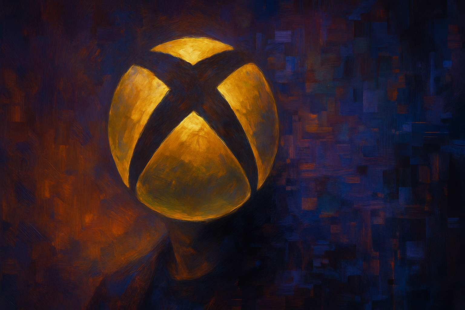
Now, after a quarter-century and eight logo iterations, Microsoft's gaming division is returning to that green, retiring the Microsoft Gaming name and restoring the standalone Xbox brand with a new mark that features a glassy, dimensional treatment and the kind of luminous finish that designers describe as "glassmorphism." (The term, for those keeping score, refers to the translucent, frosted-glass aesthetic popularized by Apple and now spreading through the visual landscape like kudzu through Georgia.)
The change signals a strategic repositioning, according to branding consultants interviewed by Adweek. The white, minimalist mark that preceded it — a product of the de-branding trend that swept through corporate identity suites in the early 2010s — no longer felt relevant, they said. The new version, with its radiating green glow, is meant to evoke both heritage and futurity, a neat trick if you can pull it off.
"The brand has done a great job creating something that feels very futuristic with its glassy finish, but also celebrates its heritage by going back to green," one consultant observed. Another noted that the mark "makes the brand feel alive again."
Whether that vitality will outlast the initial attention cycle remains to be seen. The consultants pointed out that the new logo's dimensional rendering may not reproduce well on, say, a pencil — though they also acknowledged that Xbox's consumer interactions take place almost entirely on screens, where pencils are in short supply.
The deeper question, as one consultant put it, is whether the redesign was meant to clarify what Xbox stands for or simply to generate conversation. In the branding business, of course, those two goals are not always distinguishable from each other.
Original story published in adweek.com: "Xbox's Nostalgic Green Logo Signals a Return to Its Roots"